CSS grid-column-gap Property
The grid-column-gap property in CSS is used to set the size of the gap between the columns in a grid layout.
Syntax:
grid-column-gap: none | length | initial |inherit;Property Values:
Property Value | Definition |
none | It is used to set the grid-column-gap property to its default value. The default value of grid-column-gap is 0. |
length | The size of the gap between columns is given in terms of length. The value of length can be in the form of px, em, etc. The value must be non-negative. |
initial | It is used to set the grid-column-gap property to its default value. |
inherit | This property is inherited from its parent. |
Different Example of CSS Grid Column Property
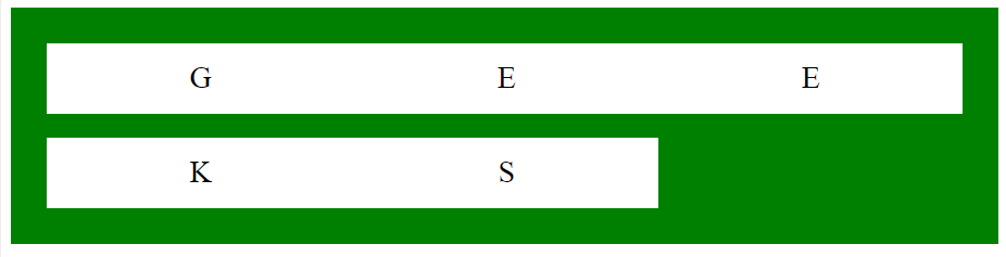
Example 1: In this example, we are using the above-explained property.
<!DOCTYPE html>
<html>

<head>
    <title>
        CSS grid-column-gap Property
    </title>

    <style>
        .main {
            display: grid;
            grid-template-columns: auto auto auto;

            /* CSS property used here */
            grid-column-gap: 20px;
            grid-row-gap: 20px;
            background-color: green;
            padding: 30px;
        }

        .main>div {
            background-color: white;
            text-align: center;
            padding: 15px;
            font-size: 25px;
        }
    </style>
</head>

<body>
    <div class="main">
        <div>G</div>
        <div>E</div>
        <div>E</div>
        <div>K</div>
        <div>S</div>
    </div>
</body>

</html>
Output:

Example 2: This example describes the default grid-column-gap property.
<!DOCTYPE html>
<html>

<head>
    <title>
        CSS grid-column-gap Property
    </title>

    <style>
        .main {
            display: grid;
            grid-template-columns: auto auto auto;

            /* CSS property used here */
            grid-column-gap: initial;
            grid-row-gap: 20px;
            background-color: green;
            padding: 30px;
        }

        .main>div {
            background-color: white;
            text-align: center;
            padding: 15px;
            font-size: 25px;
        }
    </style>
</head>

<body>
    <div class="main">
        <div>G</div>
        <div>E</div>
        <div>E</div>
        <div>K</div>
        <div>S</div>
    </div>
</body>

</html>
Output:
 Supported browsers: The browser supported by CSS grid-column-gap property are listed below:
- Google Chrome 57.0
- Safari 10.0
- Opera 44.0
- Firefox 52.0

